nós, mujeres
Rebranding for a traveling book club in São Paulo, following its new all-female literary curation and speaking to a young, mature, contemporary audience.
YEAR
2025
DELIVERABLES
Naming
Visual identity
Positioning strategy
Illustrations
Brand manual
Social media
Printed products
TARGET AUDIENCE
Women readers in São Paulo
CHALLENGE
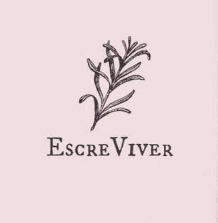
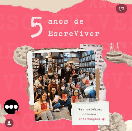
Created by women, for women, in 2018, the Coletivo EscreViver brought readers together every month. After a hiatus between 2024 and 2025, the club was reborn in 2026 with the mission of welcoming any and all women interested in reading and discussing contemporary authors writing in Romance languages — Portuguese, Spanish, French, and Italian.
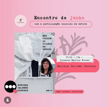
Through the briefing and conversations with the new partners, a few main issues came up about the old Coletivo EscreViver:
- A confusing name, suggesting a writing club rather than a reading one
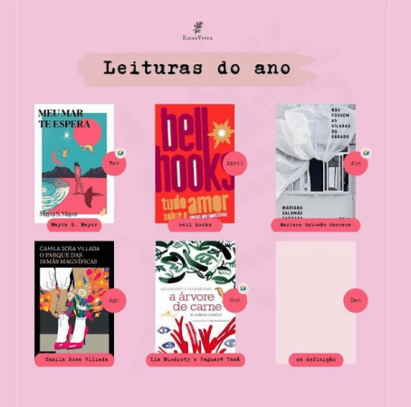
- A visual identity applied inconsistently
- The feel of a gathering between friends, with the discussion of the books in the background
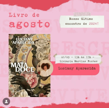
- Childlike pink dominating the communication, far from the mature reader the club wanted to attract
- Barely any outreach, social media only, with three to four readers per meeting
APPROACH
Since I was already taking part in the meetings one of the partners hosted during the hiatus, I offered to make posters to promote them. She reached out soon after to start the brand redesign, and we set out a plan:
DISCOVERY
- Taking part in the meetings as a reader
- Briefing with the partners
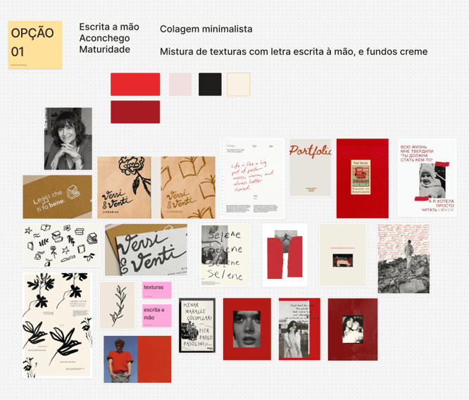
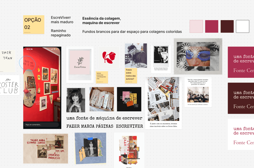
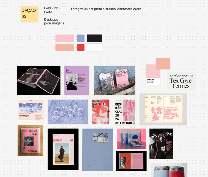
- Moodboards
- Benchmarking analysis
- Analysis of visual and literary references
IDEATION
- Three concepts and feedback rounds
- Guiding concept definition
- Naming definition
- Brand personality definition
- Communication strategy
DEFINITION AND DELIVERY
- Symbol iterations
- Type system
- RGB and CMYK palette
- Illustrations
- Canva templates
- Brand manual
- Instagram content
NAMING
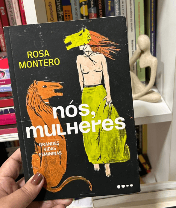
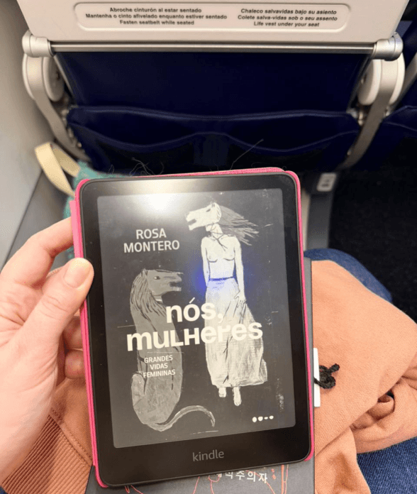
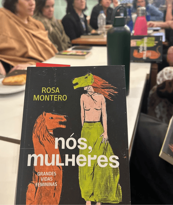
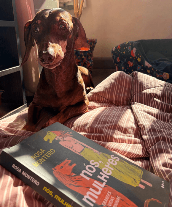
The author Rosa Montero and her work were the partners' starting point. “As loucas da casa”, a reference to the title of one of her books, was raised as an option by the partners, but I raised the possible confusion between the club and militant feminist collectives, as well as it being too long to be easily recognized.
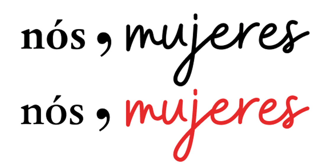
So, the name nós, mujeres sets out to unite and connect readers to authors and to one another. “nós” as the union of the club, all of us who make it exist “mujeres”, taking in Rosa Montero's Spanish, as a reference to the Romance roots of the authors in the new curation.
We kept the name in lowercase to bring modernity and youthfulness to the brand.

PERSONALITY
The club is led by millennial women, and the curation fosters mature, introspective discussions about important contemporary subjects.
The personality rests on four attributes — mature, welcoming, intelligent, and young — and corrects the earlier drift, when infantilized communication and visual identity drew an audience with different goals from the club's.

SYMBOL
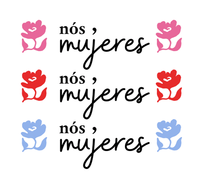
The previous logo carried a sprig, and the reference to nature was kept: a flower coming into bloom gives shape to the club's new cycle. The larger flower stands for the club, a place of meeting and welcome for each reader, who in turn is the smaller flower.
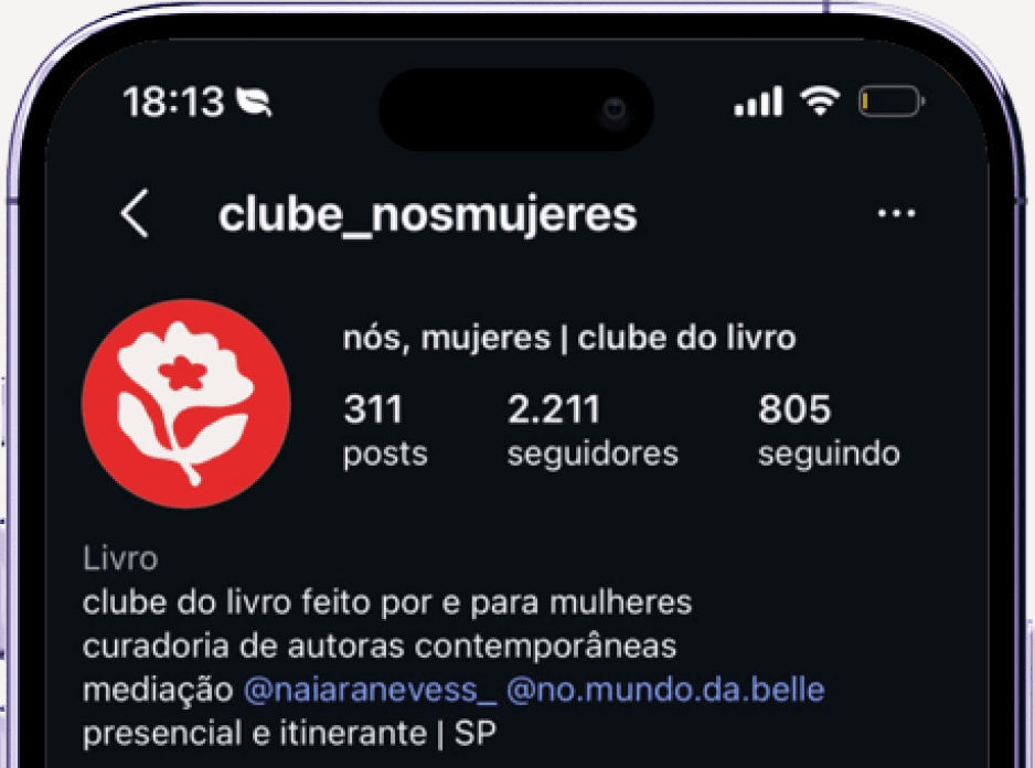
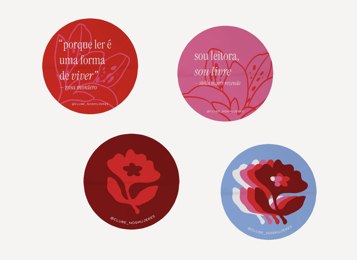
The symbol is used in round profile icons, as a supporting graphic and as a content separator, giving club readers immediate recognition. Its organic, rounded forms contrast with the serif type of the logo.
LOGO AND ITS VARIATIONS
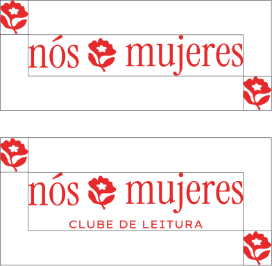
The logo is the wordmark and the symbol together. It is highly recognizable both with and without the tagline. The tagline version is used outside social media, to give context to anyone who doesn't know the club yet.
Without the tagline, it holds up from 19 pixels on screen and 0.5 centimeters in print. With the tagline, the limits rise to 56 pixels and 1 centimeter.
COLORS
Bright red came in as the brand's proprietary color, followed by dark red. To preserve the link with the Coletivo EscreViver, we kept the soft pink and a vibrant pink version, which make up the supporting palette along with cream, black, and a contrasting blue. Every color has an RGB, CMYK, and Pantone equivalent.
A contrast table defines which combinations can carry text and which are restricted to covers and illustrated compositions.
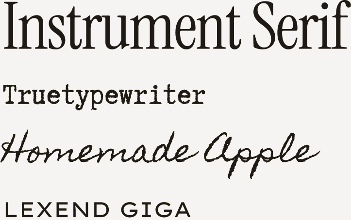
TYPOGRAPHY
Instrument Serif, modern and elegant, was the first choice for the logo and for the official brand typeface.
Truetypewriter PolyglOTT renews the typewriter face the Coletivo EscreViver used, keeping the link with the previous identity.
Homemade Apple, handwritten, echoes the hand-drawn line of the illustrations and the zines. Reserved for decorative highlights only, given its low legibility.
Lexend Giga comes in, in uppercase, for the information a reader needs to retain: date, place, and the club's handle.

ILLUSTRATIONS
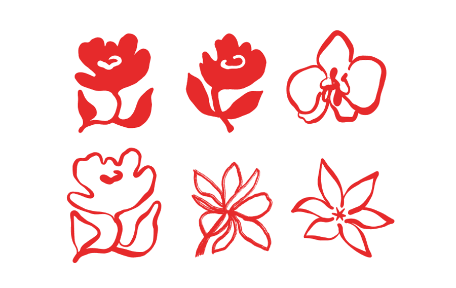
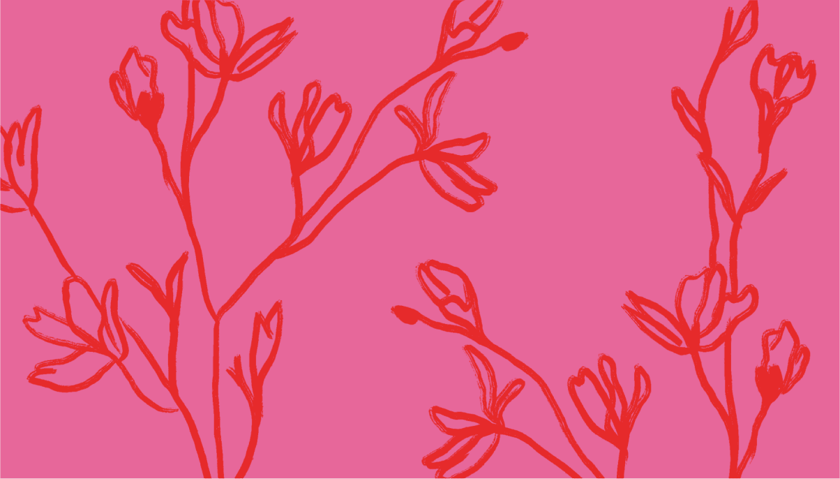
The floral illustrations were drawn by hand and vectorized, with the handmade line kept to reinforce the craft and the warmth of the visual identity. Flowers, branches, and sprigs, drawn in abstract and realistic versions, were chosen to extend the symbol into the rest of the system.
They work at any scale, from a small detail to a full cover composition, with a limit of one or two per piece.
They can sit over text, as long as the legibility of the main information is preserved.
COMMUNICATION STRATEGY
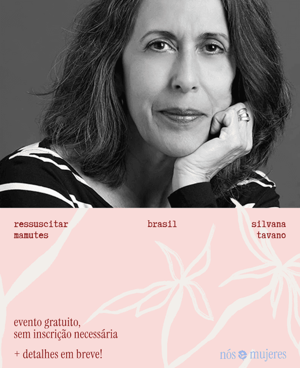
Communication with readers is split across three fronts: WhatsApp, Instagram, and printed posters.
WhatsApp holds the community of the club's regulars, where they trade impressions of books, reading recommendations, events, and so on. Instagram is the main channel through which a new reader finds the club, so the communication has to be consistent in both visual identity and information. The schedule goes out at the start of every month, with date, time, and place.
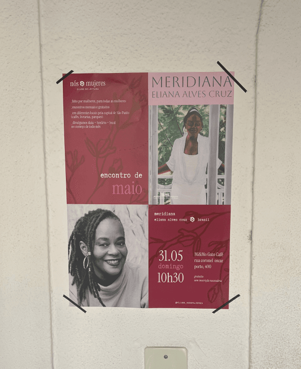
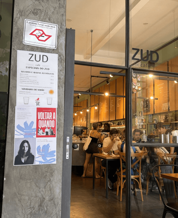
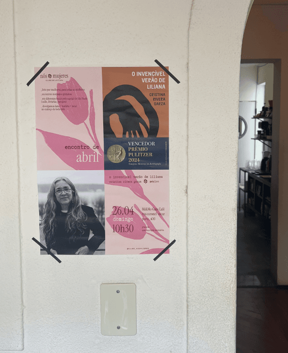
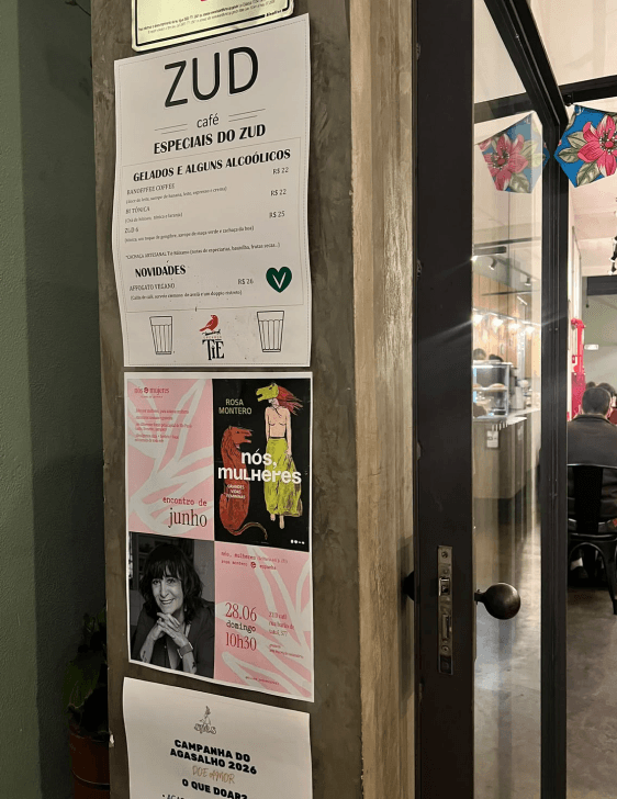
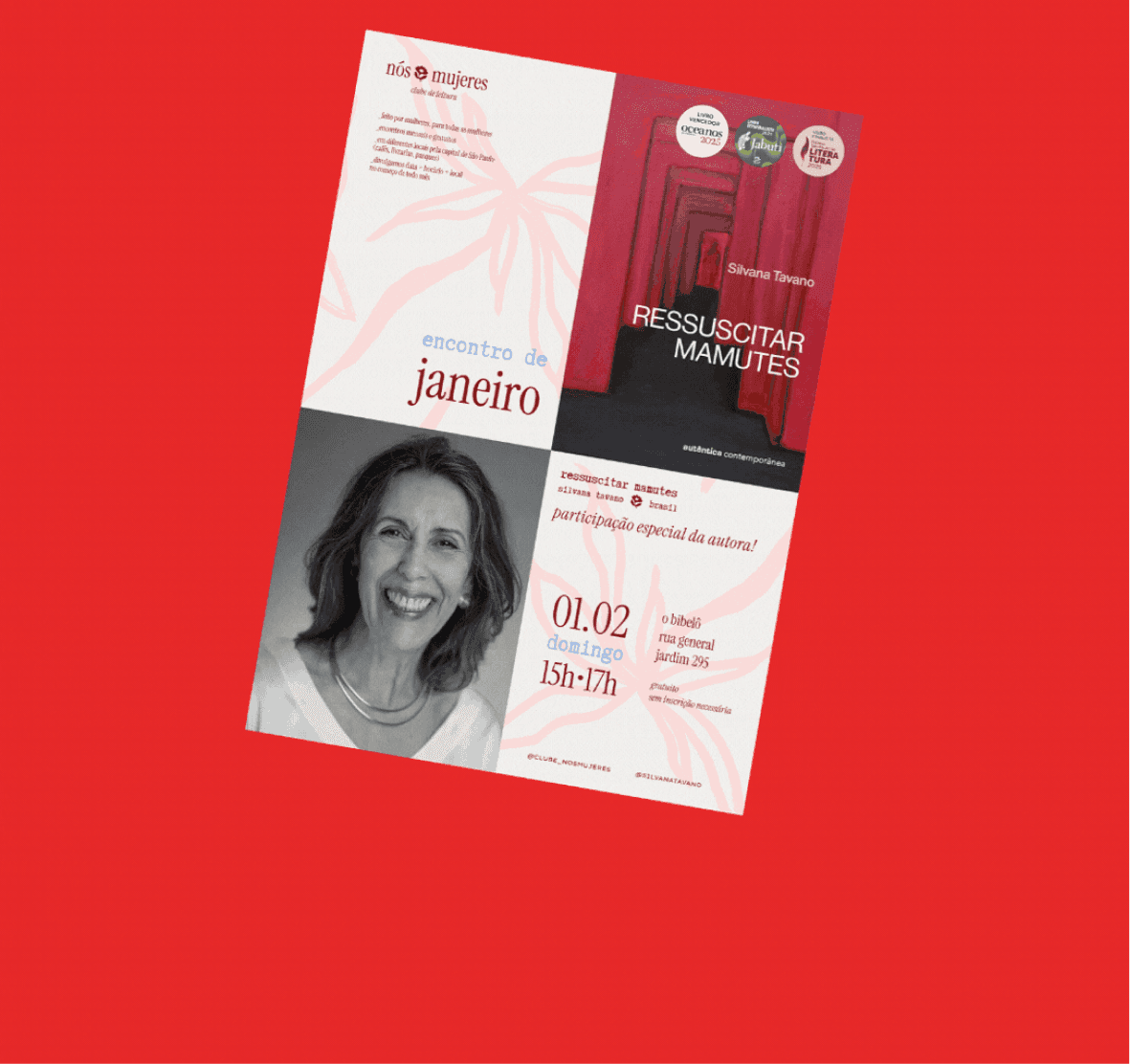
Last but not least, the A3 posters. Printed every month and put up two to three weeks ahead in the café or bookstore hosting the meeting, the poster speaks to whoever already goes there and doesn't know the club yet.
SOCIAL MEDIA
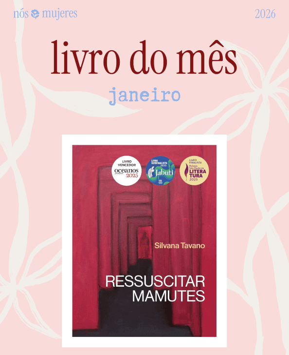
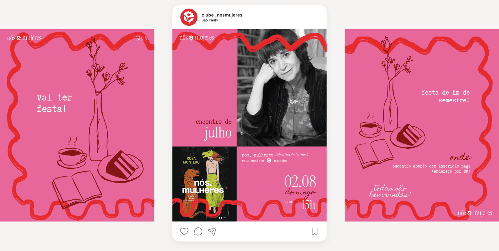
Instagram runs on three fixed templates: book of the month, meeting of the month, and books of the semester. The layout and the order of the information never change, which makes the pieces recognizable from one month to the next. Book of the month and meeting of the month are published as a pair, and the record of the meeting follows the same format.
So the fixed template doesn't wear out, each month gets a different combination of two or three palette colors and a background illustration. Special posts, like the end-of-semester party, get artwork of their own within the same style.
PRINTED PRODUCTS
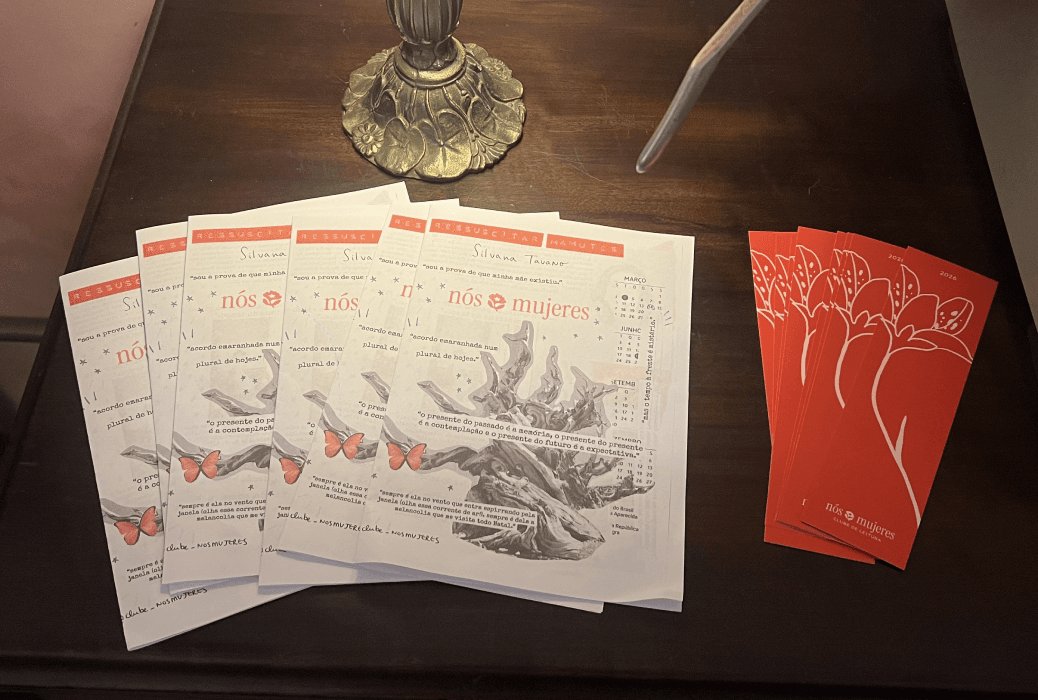
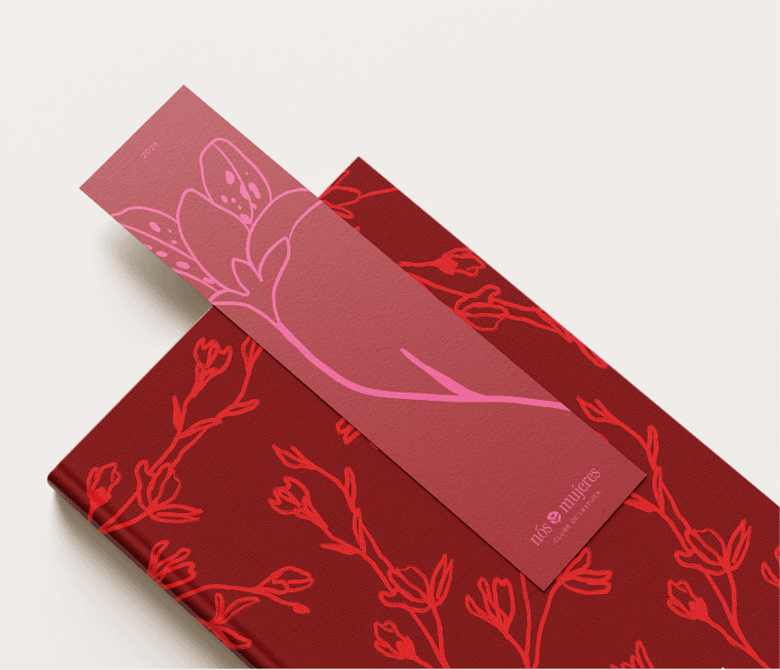
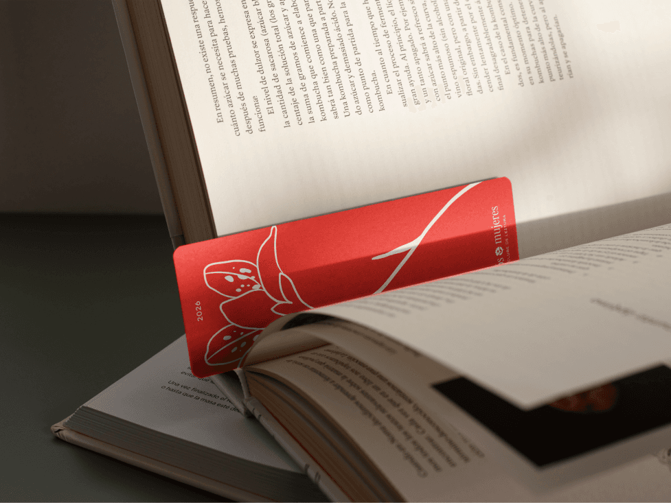
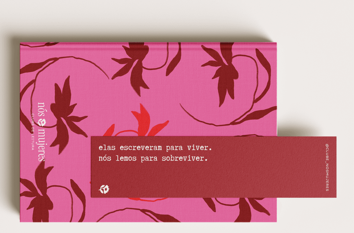
Every reader coming to a meeting for the first time gets a free bookmark and a zine, created from that month's reading. They all take a piece of the club with them, reinforcing the community and welcoming new readers.
For FLIP, the club brought stickers and an alternative version of the bookmark, reaching beyond São Paulo.
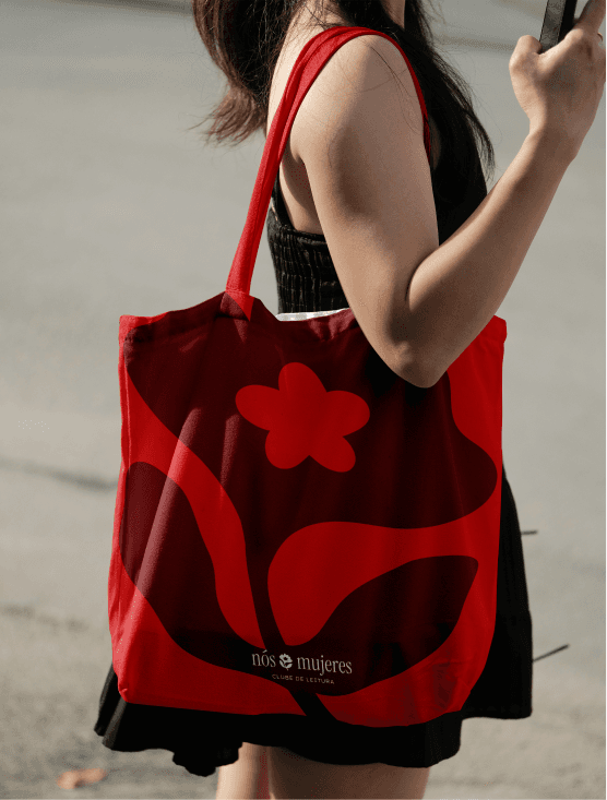
Since the meetings are free and printing comes out of the partners' pockets, the next step is a line of products — notebooks, caps, tote bags — to sell and fund future giveaways.
IMPACT
The new visual identity answers the old club's pain points while keeping the connection to its past. The name, the symbol, the striking colors, and the illustrations stand for a welcoming, modern community of women that values time together and meaningful connections. A consistent visual system and communication position the brand as serious and trustworthy, and help new readers find the information they need.
The final impact on the club was two to three new readers per meeting, averaging 15 to 18 readers in total. Before, the average was 4 readers per meeting. The quality of the meetings went up too, with conversations focused on the reading and readers growing closer.