sem firula.
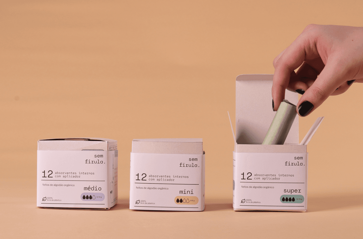
Applicator, packaging, and visual identity redesign for tampons, made for the agender, young, urban consumer — with a focus on functionality and sustainability.
YEAR
2025
DELIVERABLES
Research Report
Applicator
Packaging
Visual Identity
Illustrations
TARGET AUDIENCE
People who menstruate and use tampons
CHALLENGE
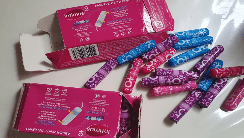
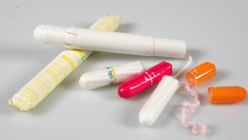
Buying and using tampons isn't such an easy task for everyone. Tampon users are mostly cisgender women between 18 and 40, from gen Z and millennials, who in interviews and research reported a few main pain points:
- Usage instructions that are illegible and hidden inside the packaging
- Little awareness of Toxic Shock Syndrome, which can be triggered by improper use of the product
- It's not always possible to wash your hands properly before inserting the applicator, raising safety and hygiene concerns
- A fragile box that falls apart easily and doesn't protect the tampon
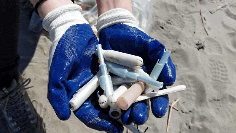
- Frustration with the amount of plastic in other brands' applicators and packaging, none of it biodegradable
APPROACH
Taking the Double Diamond design-thinking process as a starting point, my methodology went as follows:
DISCOVERY
- Desk research (Anvisa, trends, materials)
- Benchmarks
- Field research (drugstores and supermarkets)
- Qualitative interviews
- Quantitative interviews (12 participants)
- Analysis of online shoppers
DEFINITION
- SWOT analysis
- Requirements definition
- User journey
- Comparison matrix
- User flow
IDEATION AND PROTOTYPING
- Ergonomics studies
- Visual identity construction
- Sketches
- Prototype iterations
- Technical drawing
- Print tests
- Final prototype
THE APPLICATOR
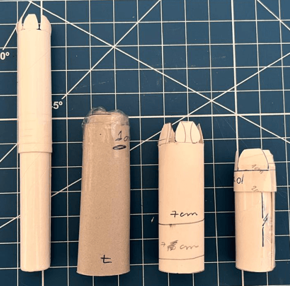
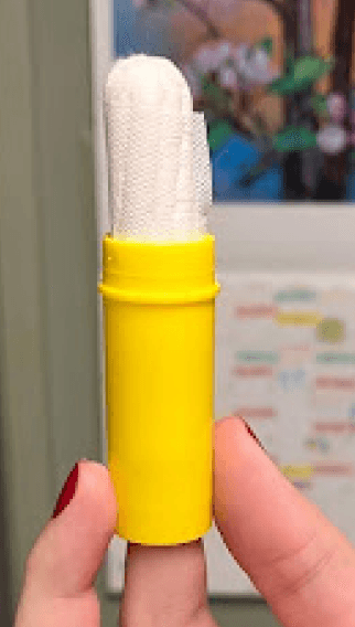
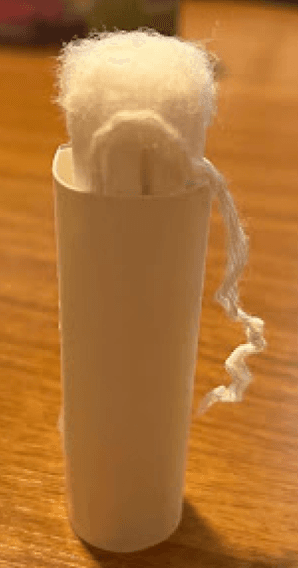
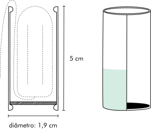
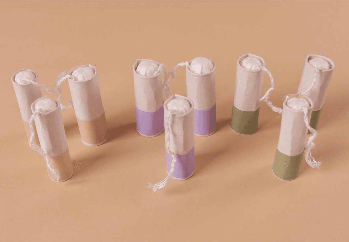
The cylinder-shaped applicator hugs the tampon, with inward-folded tabs that keep the movable base from slipping out.
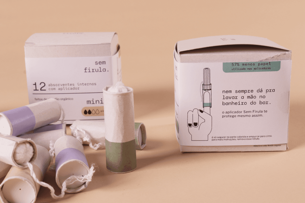
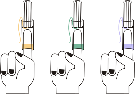
Ergonomically similar to inserting a tampon with your fingers, the applicator has a designated colored grip area and a movable base that keeps fingers away from intimate contact, ensuring hygiene.
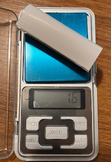
Made of paperboard with no plastic coating.
INDIVIDUAL WRAPPER
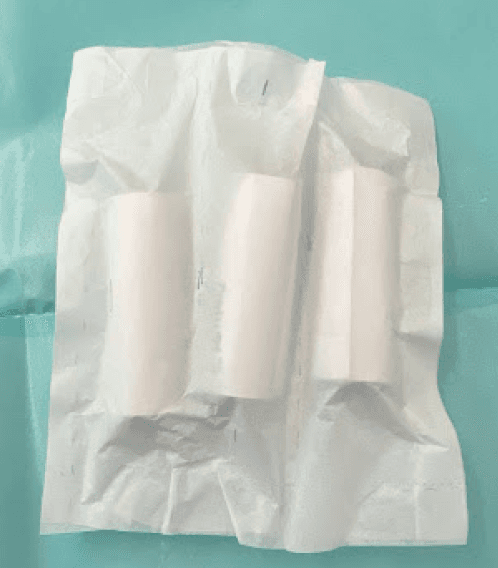
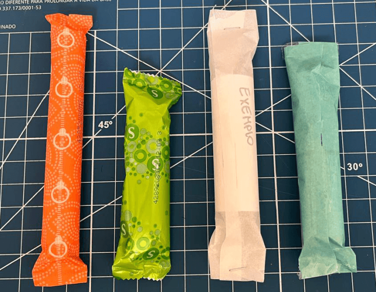
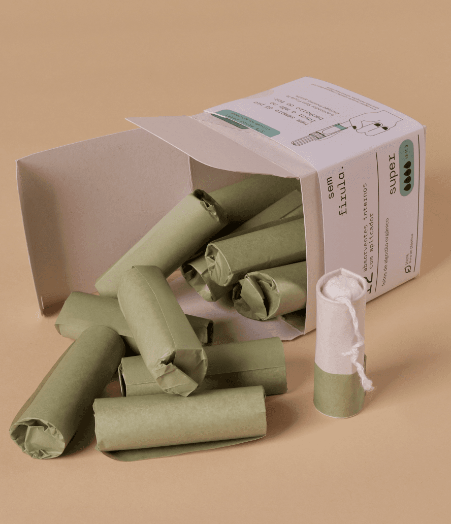
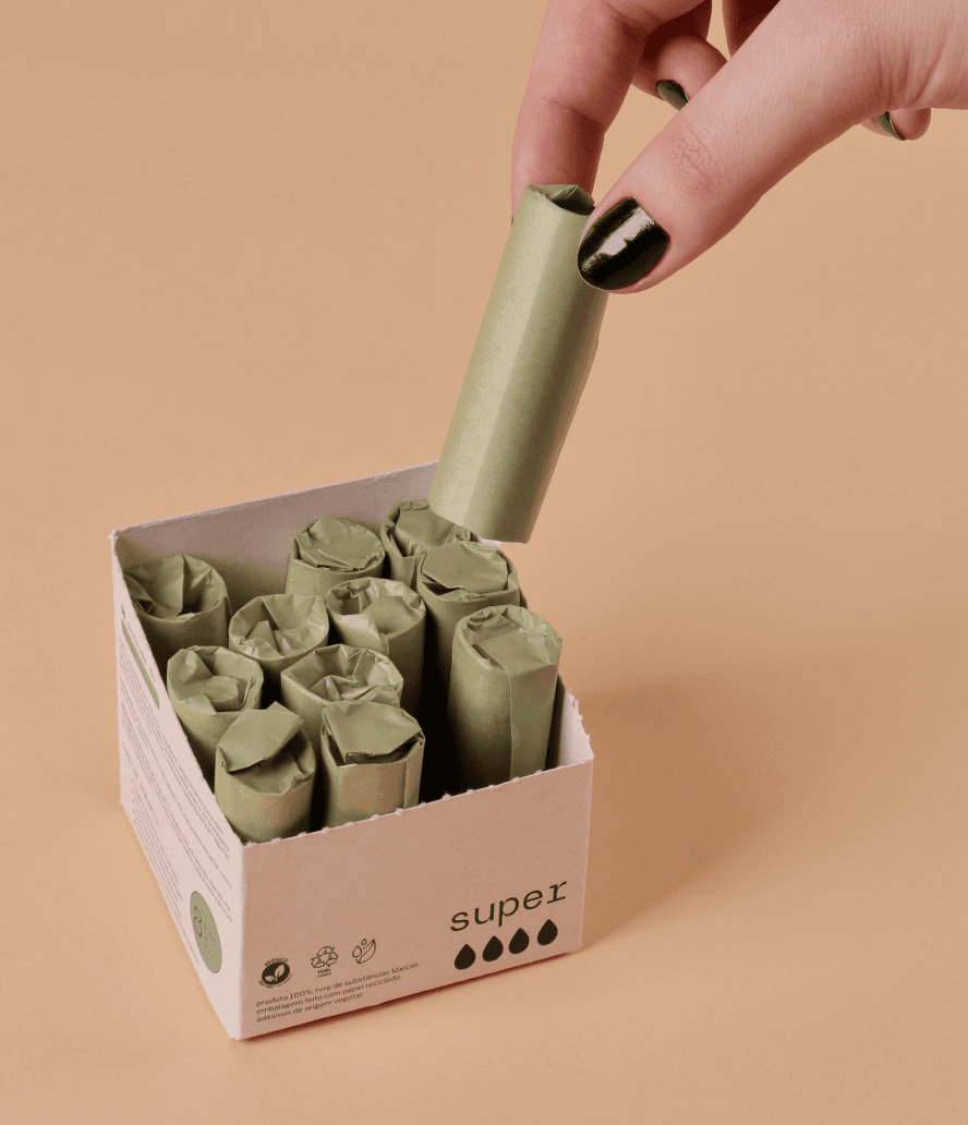
The individual wrapper is made of glassine paper with no plastic coating, widely used by the food industry to protect food from moisture.
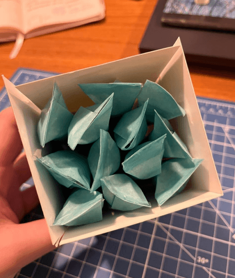
Paired with the applicator, which encases the tampon, the wrapper folds closed without glue and adds an extra layer of moisture protection — especially when the tampon is carried in a bag with other items.
Removing it is easy and intuitive: just unwrap.
BOX AND SLEEVE
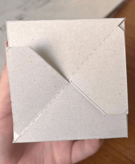
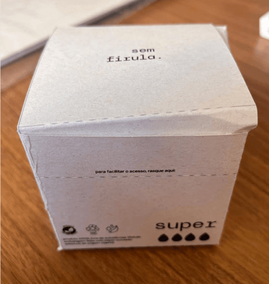
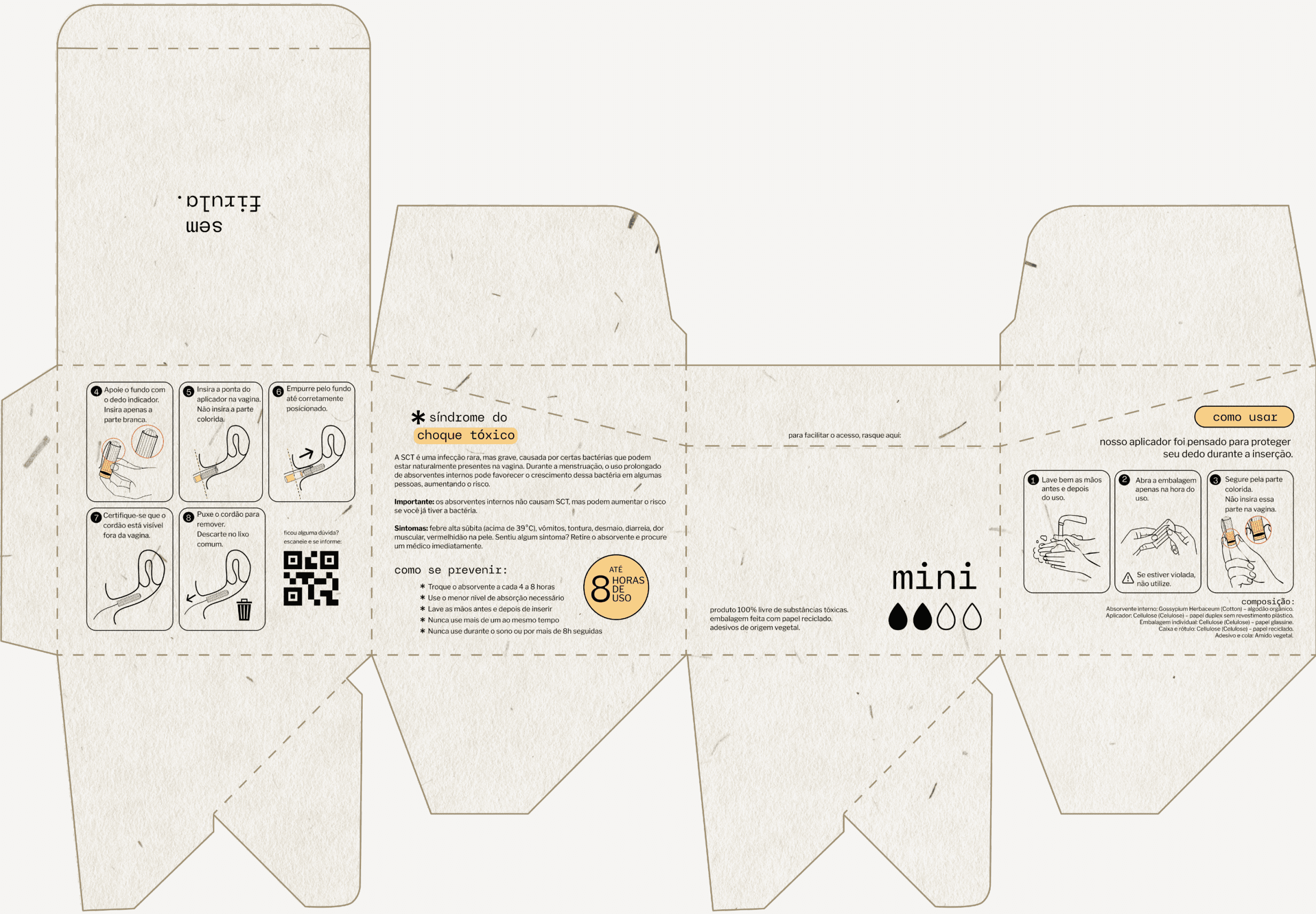
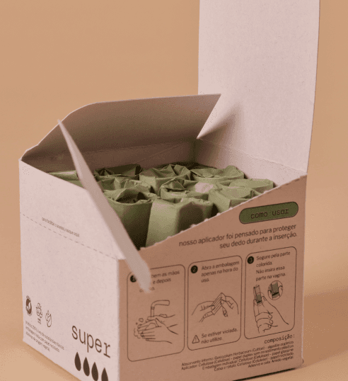
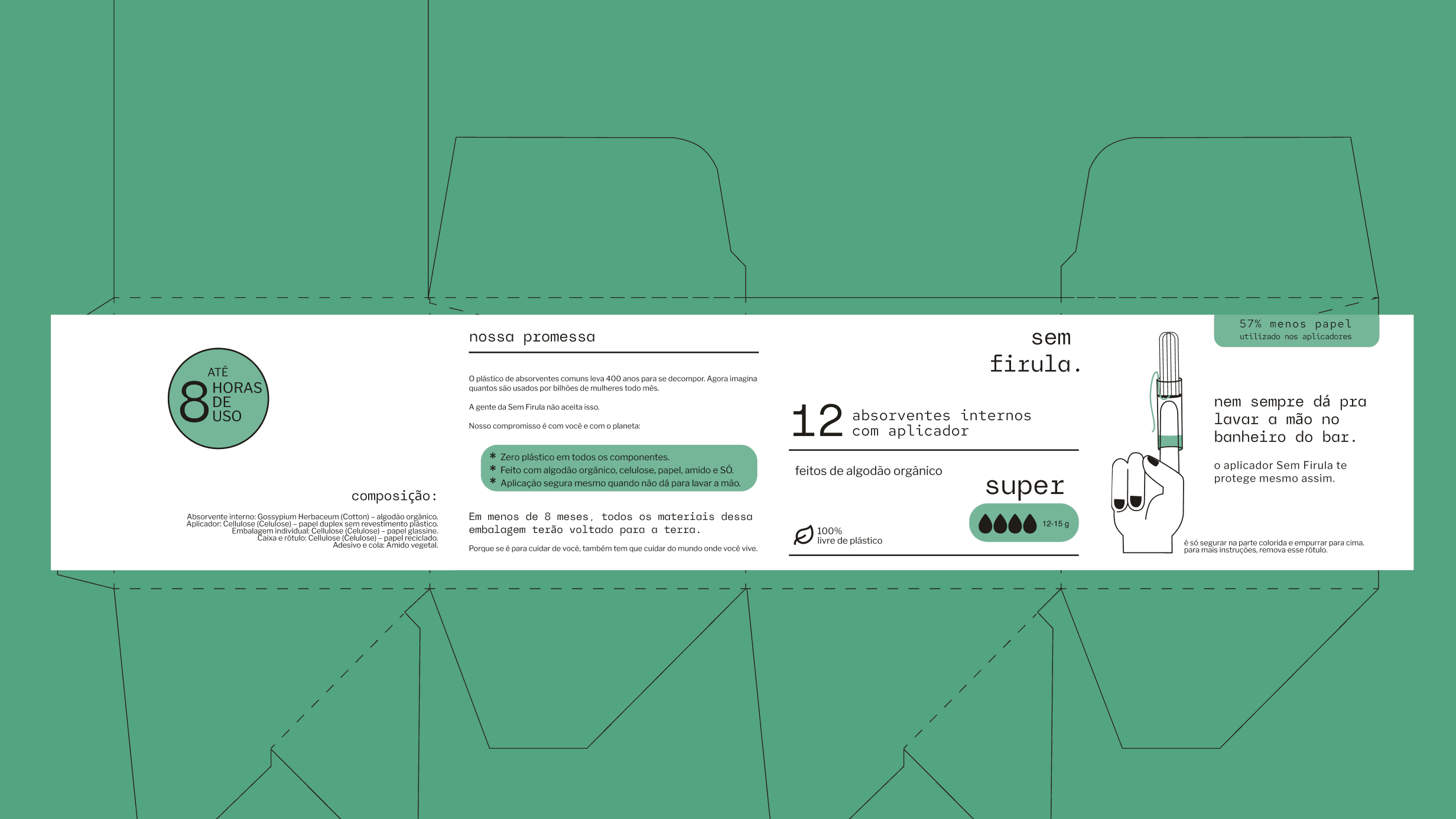
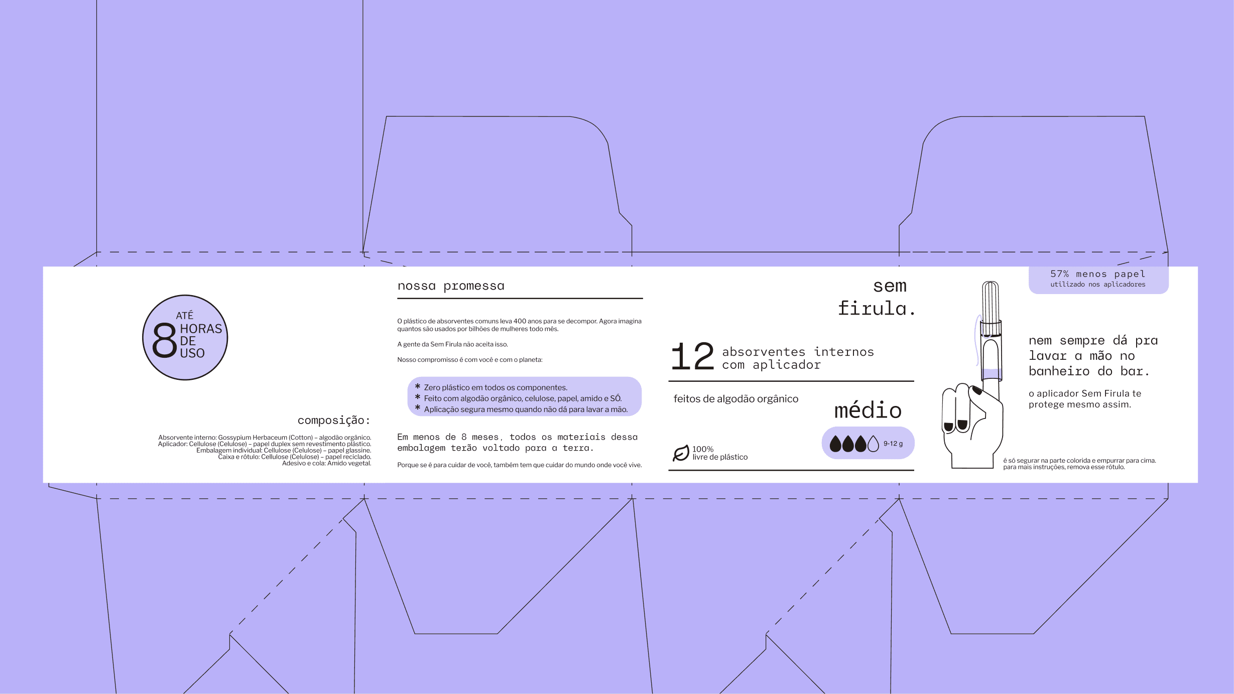
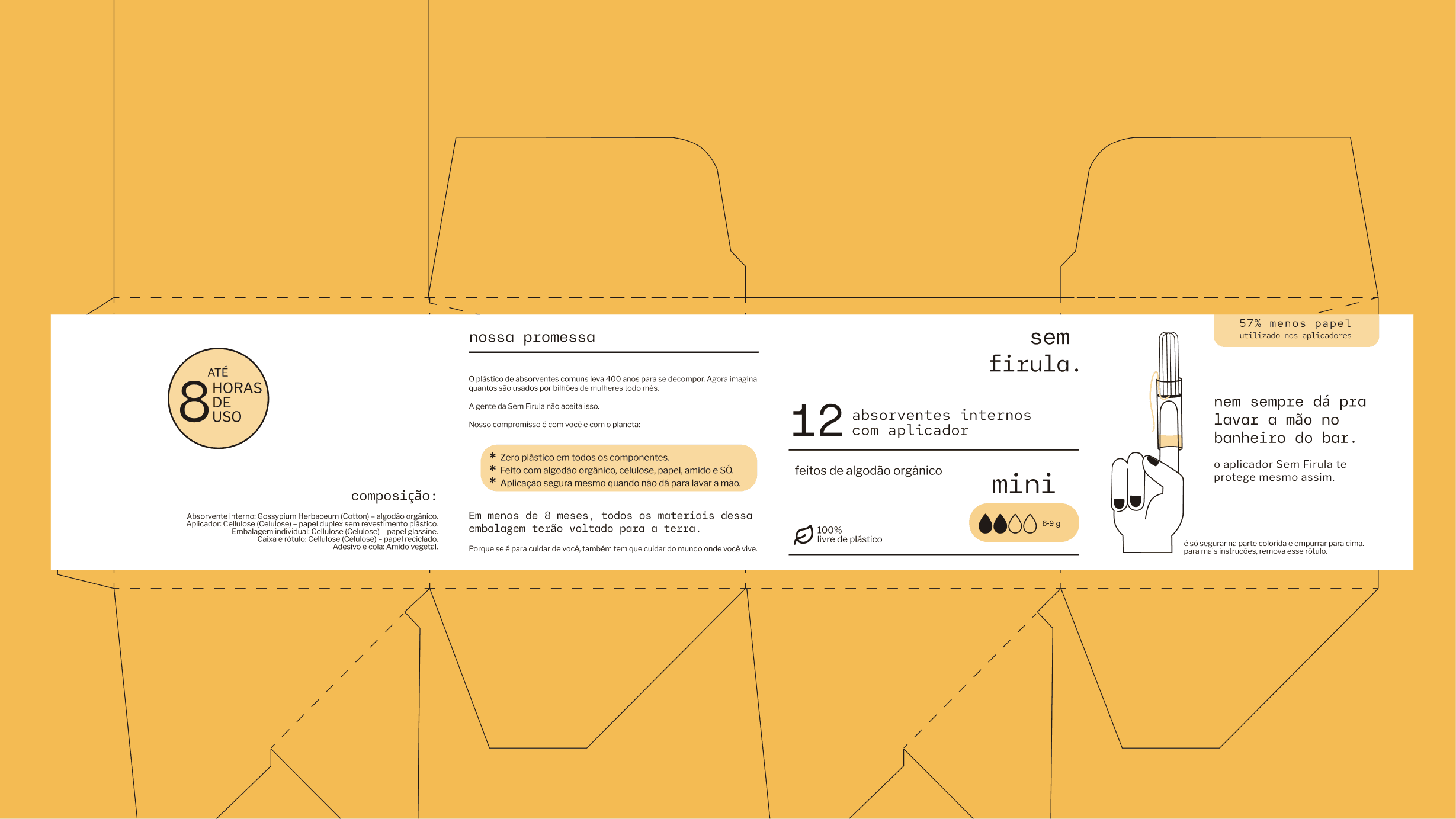
To address the pain point of not finding usage instructions and safety information easily, the box was designed to be consulted whenever needed. A perforated line makes it more practical to store and grab tampons while open.
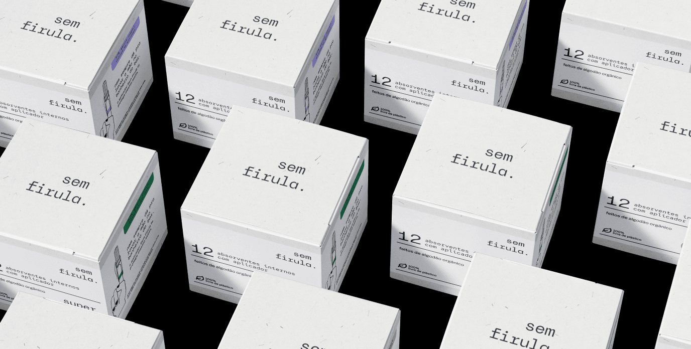
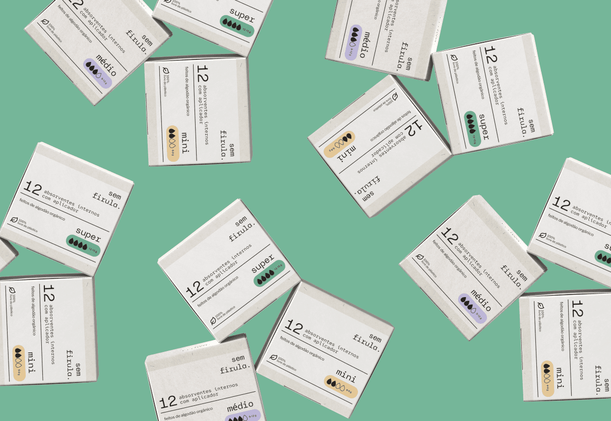
The sleeve is the customer's first contact with the brand, so it carries the Sem Firula. mission and highlights the reduction in material used.
Both are printed on recycled paper with vegetable-starch glue, and decompose within 2 to 6 months in landfills.
VISUAL IDENTITY
The target audience is modern, young, environmentally conscious people always caught in the urban rush. They don't feel represented by the pink-toned brands that treat menstruation as something stereotypically feminine.
Aiming for an accessible, global brand with no excess or exaggeration (sem firulas — no frills), I drew on the Bauhaus movement to create a neutral, young brand.
Each color stands for a different flow: green for super, lilac for regular, and yellow for mini, making them easier to find on shelves.



TYPOGRAPHY
The display typeface Avenue X — experimental and geometric at heart, inspired by urban design — fits the brand's proposal well.
The monospaced version of the Red Hat typeface reinforces the technical character the brand is after.
To ensure legibility, the sans-serif Libre Franklin was chosen for instruction text.
ILLUSTRATIONS
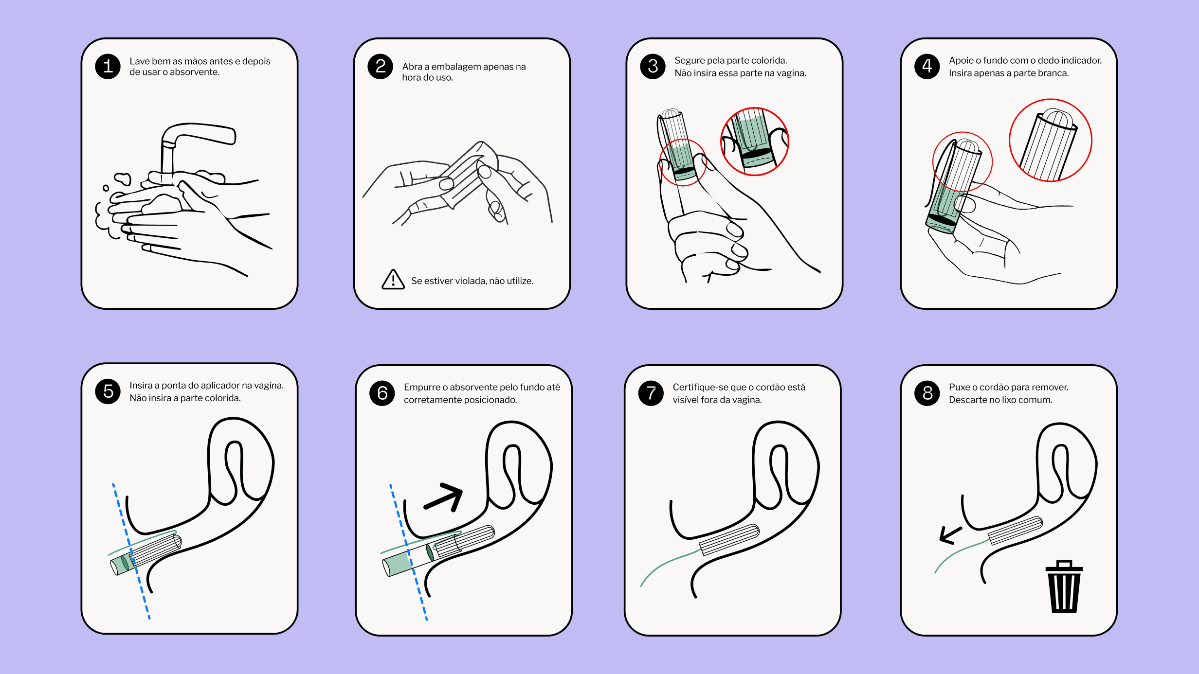
The usage instructions were inspired by step-by-step manuals, like furniture assembly guides, to give users confidence and ease.
So the illustrations are clean, with intentional use of color to highlight specific actions or details.
The illustrations that accompany the brand follow the same modern, vector style.
IMPACT
The proposal answers the main pain points reported in research, offering a more hygienic, ergonomic, and compact applicator, clear and accessible instructions, and sustainable packaging — with plastic fully eliminated, decomposition within eight months, and a 57% reduction in the final product's weight.
The minimalist, agender visual identity stands out on the shelf, breaks with the industry's feminine stereotype, and communicates health care in an inclusive, informative way.